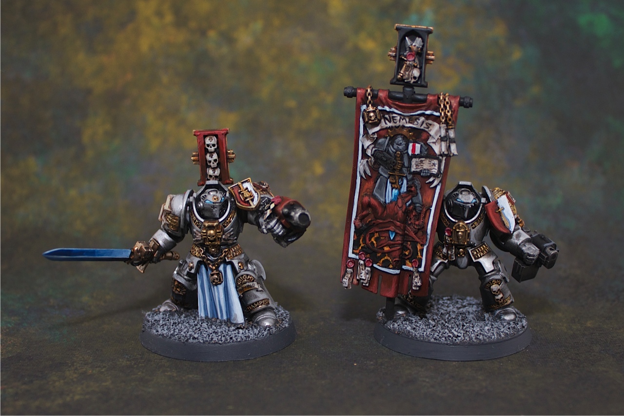
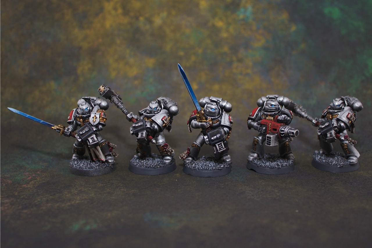
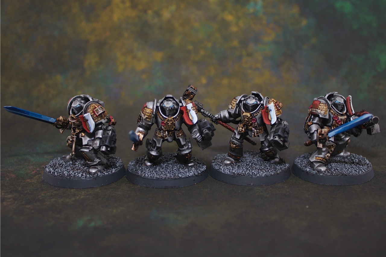
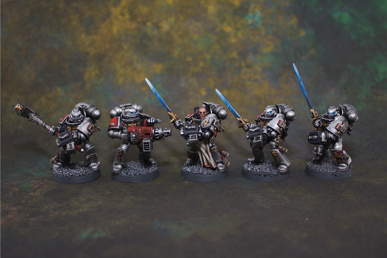
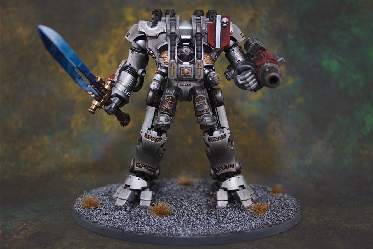
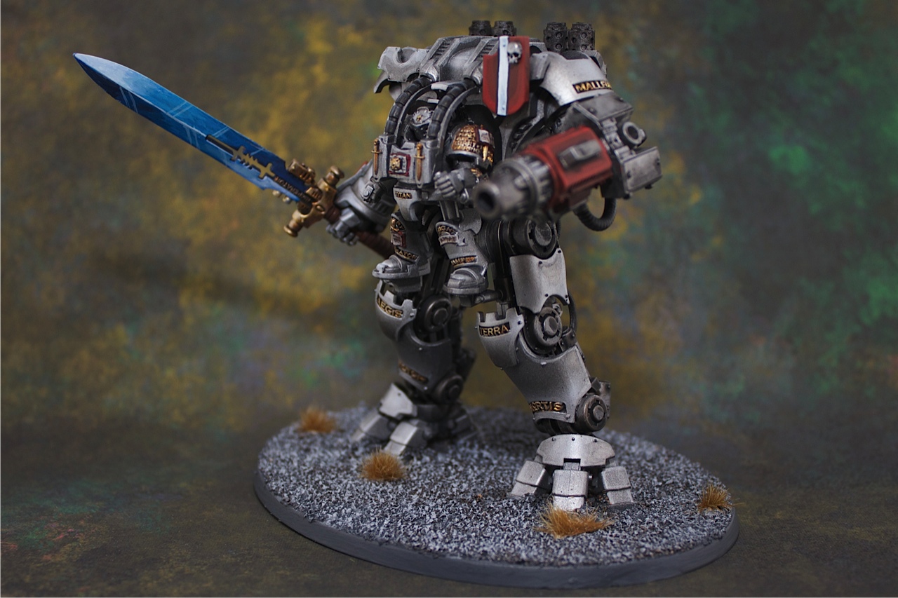
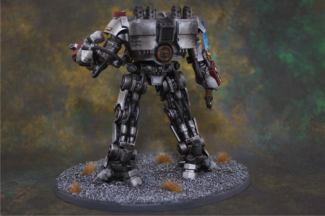
Finally the Grey Knight force has been completed. We followed the client’s request to make the color scheme the same as the Games Workshop Studio one. This commission was painted to our ‘standard quality’ level. All the swords were done as power weapons – they were all colored dark blue blended through to white. The metal of the armour was kept as a metallic light color with very little darker shades applied, this would allow their bolter and other dark metals to really stand out against the armour. The crimson red really stands out nicely against the metal. Finally the client wanted a plain grey base which I don’t mind as it draws the focus back to the miniatures. I should mention that the photos below were taken using the Hanger 18 Miniatures photo backdrops which are fantastic (I’ll do a review very shortly on these).
The Grey Knights turned out to be a strikingly good army to see on the field due to their simple high contrast color scheme. Just goes to show that sometimes a simple color scheme can look better than a complex but higher painting standard color scheme.